Evaluation Questions:
In what ways does your media product use, develop or challenge forms and conventions of real media products?
Our media product uses forms and conventions of real media products. The way that we have incorporated these forms and conventions into our final product is through the use of sound, camera, mise-en-scene and through the characters.
The soundtrack to our opening has an eerie feel to it which creates suspense and is tension building music.
It incorporates generic conventions of thriller films such as suspense, enigmas etc. This makes the audience feel uncomfortable watching the film as the soundtrack sounds like wedding bells, church like organs. The audience are made to feel uncomfortable due to the shots of the cut up body parts scattered around the house.
Our use of shots that we have used in our media product use the forms and conventions of real media products. Specific scenes which show this is the image of a close up of the bloody hand with the ring on it.
Through the use of mise-en-scene, we have also used and developed forms and conventions of real media products as we have used fake blood which is commonly used in almost every thriller film.
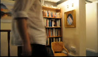
Our characters in our media product also follows the forms and conventions of real media products. The way that this is done is through our main through the way he is dressed. He is smartly dressed in trousers and a shirt which is typical of most killers in films which we have found from our research. However, this challenges the conventions as the way he is dressed is more of a typical action film. The conventions that we have used do not directly indicate other thrillers that have influenced our work. We have tried to be as original as possiblenot trying to fall into the 'cliche' type of thrillers, By using subtle conventiosn such as fake blood and tension building music, we are portraying the typical conventions of thrillers, However we are not overtly presenting these conventions as our antagonist does not look like a typical stereotypically deranged killer, he is dressed formally in trousers and a suit.
Our media product is a hyrbid genre - psychological thriller. The conventions of a psychological thriller in which (until the often violent resolution) the conflict between the main characters is mental and emotional, rather than physical. Our use of conventions indicate this as the main character is made aware to the audience of having mental issues.
How does your media product present particular social groups?
Our media product features a child and a man. The man is the main character in our film and is meant to be agesd roughly in his late twentys/thirtys and is portrayed as being deranged. It consists of two characters, a male and a female and through the use of props and the way the characters are dressed, we have used specific types of clothing that fit into each gender stereotype. The male is dressed in trousers and a shirt which is the stereotypical clothing of a male.
The female character in our media production is not shown as a full length character showing her full body as her dismembered body parts are scattered around the house. She is shown with a veil bing put on her head which is symbolic of marriage as it is considered as bridal wear. She is also shown with a dolly shoe being put onto her foot, making it clear to the audience that it is a female character.
We have chosen to rate our film 15 and the target audience is everyone above that. This links into the target audience as they can relate to the film either if they have younger siblings that would be compared to the young girl in the film or if they have children of their own. This would then create a fear amongst the audience as to whether this could happen to them.
What kind of media institution might distribute your media product and why?
I believe that our media product could be produced by a major Hollywood studio as we have followed the forms and conventions of typical thriller films and have ended the opening at an ambiguous point therefore leaving it with a lot of ideas to be carried on. It isn't specifically similar to existing products however, due to the fact that it is a hybrid genre, it has elements of both thrillers and horrors and i can see it being shown in the cinema.Our product could be an arthouse film as it could be targeted at a niche audience with an acquired preference for films with a psychological twist. The opening has an ambiguous ending leaving the rest of the film to have many different story lines which can be expanded. Arthouse films target a specific audience with the same preference of film which our product could easily be adapted to.
Who would be the audience for your media product?
We have decided to rate our film at 15. From the research that we found from the internet, we found that it is predominantly males who enjoy thriller and horror genres more making us focus more on targeting our product to males than females. From conducting our research, looking at the BBFC website, we rated our film as a 15 with the age range being from 15-30.
How do you attract/address your audience?
We attracted our audience by carrying out research of different horror and thriller films to use the characteristics that we found in our opening sequence. We also carried out questionnaires in which we gained feedback on our storyboard, rough cut and final product from our target audience.
We posted our rough cut and final cut on Facebook and YouTube which are two popular forms of e-commerce which are widely used by our target audience to gain further feedback. This was helpful as it gave us an insight as to what people actually thought of our media product, the feedback was predominantly positive however we did gain negative feedback which we used constructively.
The font that we have used in our title sequence is white on a black background attracts a male audience as we have used black and white which are harsh colours. We chose the typography to look 'hard' rather than feminine which was what we orignally chose as it would be parallel to the wedding theme as we had originally thought to have a script font which would look like the font on wedding invitations.
The scene in which the male antagonist is placing the veil on the females head is designed to make the audience uncomfortable. This is due to the fact that we have specifically decided not to show the females face, only the back of her head so the audience are left in mystery as to what she actually looks like creating suspense.
What have you learnt about technologies from the process of constructing the product?
From the filming process we found that the cameras that we used were not of great quality which therefore affected the quality of our product making it not as clear as we had hoped it would've been. The filming process was taken over by Stephanie and Alexandra who overcame any problems they faced with the equipment by resolving any issues they had with it. Through practice, we were able to get steady shots and play around with the camera more getting different effects which all had different effects on the audience. Stephanie was using the programme Premier Pro the most in the editing process as she picked up how to use it fairly quickly as we were all new to the programme. The editing was a lot harder and more time consuming than i had originally thought as it took up most of our time. Our preliminary task gave us a small insight in the amount of time is put into the editing process however we were all surprised as to how much time and effort is put into it. The feedback we received on our rough cut gave us a clear indication that a variety of camera angles is vital in showing technical skills therefore improving the quality of the opening sequence.
Looking back to your preliminary task, what do you feel you have learnt in the progression from it to your final product?
We started off with the research on which genre to use, this gave us an understanding on each of the genres. We also conducted research on hybrid genres and sub-genres which helped us in deciding what genre to use as we were drawn to a hybrid genre. This therefore let us know specifically what codes and conventions were expected of these genres in order for us to fulfil what we had to portray. By conducting our research and gaining an understanding of our hybrid genre it made the planning a lot easier as we knew what was expected of our opening sequence. Throughout or planning we learnt that we needed to avoid cliché ideas and locations in order to give our sequence the unique element.
Our preliminary task gave us an insight into what we will be doing in our coursework - the filming, editing and planning processes. It gave us a chance to explore each of these stages, which was a smaller scale to our coursework however, it gave us time to become familiar with the equipment and technologies. From the amount of time spent on planning, filming and editing of the opening sequence, the progression we made from our preliminary task was huge. This made us more confident with the equipment we were using and gave us an understanding on the amount of time and effort will be needed to complete the task.
From watching the preliminary task and comparing it to our final cut you can clearly see a progression on the use of the camera and the editing. The storyboards which we made also show a clear progression of in depth research and of the codes and conventions expected of the genre.
I feel a lot more confident with the equipment as compared to when I used it in the preliminary task as i had more time to use it and explore the way in which to use it and how to create different effects.
Overall, I believe that we were successful in creating an opening that fulfils the conventions of a thriller. Despite the problems we faced which we resolved and overcame, I am happy with our final product as it is unique yet still complies to what is expected. We have used a wide range of different shot angles and editing effects which create the intended effect we wanted to create. The soundtrack which i found fits perfectly into the sequence and gives the effect which we wanted it to.


